
01
De Blafbus is a dog services subscription — a flexible, all-in-one membership for dog owners. The idea started as “Pootjes op pad” but it could’ve been about any animal. Narrowing it to dogs and giving it a stronger identity made the concept click.
02
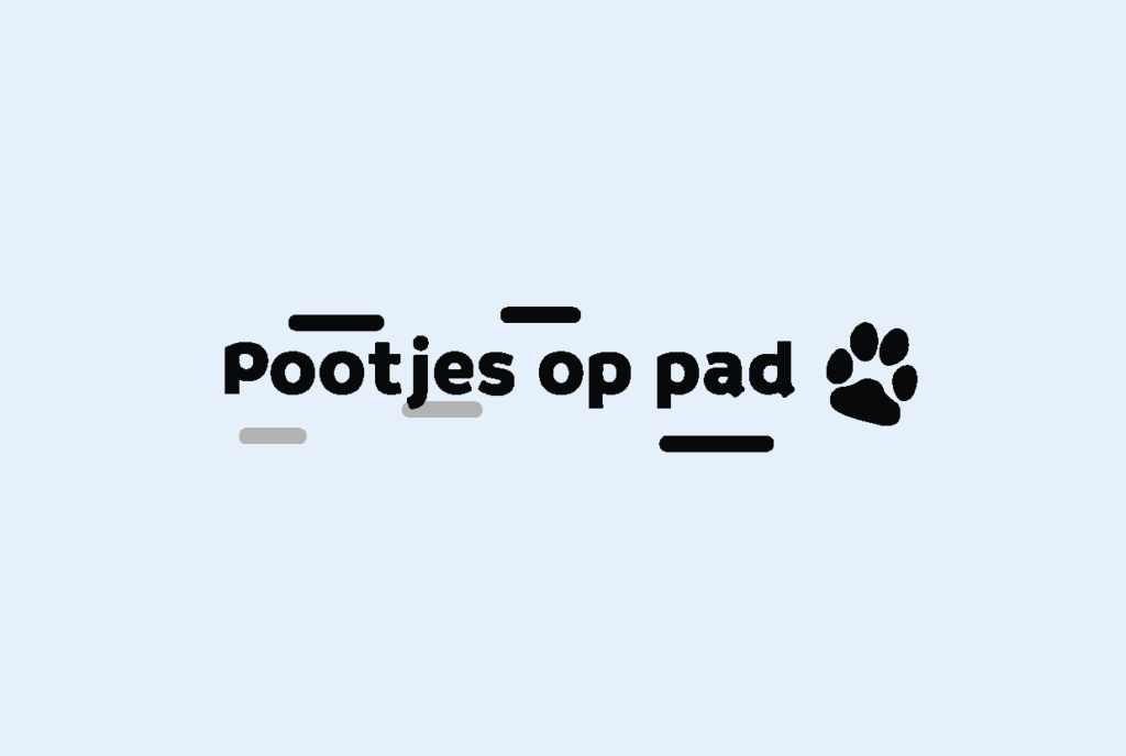
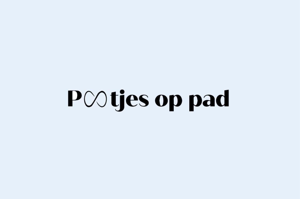
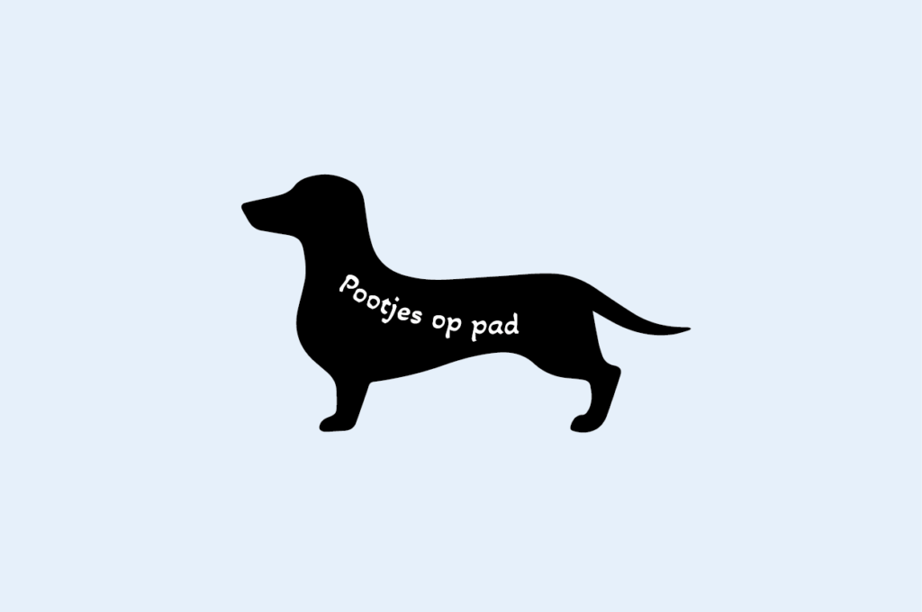
I went through several logo iterations before arriving at the final design. Each version pushed the identity closer to something clear and ownable.
03
Three deliberate colours, each chosen for what they communicate to the Blafbus audience.
Confidential and complementary: brings trust and professionalism to the brand.
Confidential, friendly and calm: the soft backdrop that keeps the brand approachable.
Warm, friendly and overflowing with energy: grabs attention without being aggressive.
04
The key differentiator: you choose your own schedule. Don’t need a haircut? Skip it. Want only group training? Done. Want both training formats? You get a discount.
Only want walks? Just pick walks. Don’t need grooming? Leave it out. The subscription adapts to you, not the other way around.
Choose between group sessions or one-on-one training. Select both and you automatically unlock a combined discount.
“My dog doesn’t need a haircut at all, I do it myself.” That’s perfectly possible! Just leave grooming out of your plan.
The top-right corner always shows how many spots are still available, nudging you to act before they’re gone.
05
The full Blafbus website, designed in Figma.
Press [f] for full screen
The full Blafbus website, designed in Figma.
Turn sideway for a better view.
06
PREVIOUS PROJECT
NEXT PROJECT